

Effective Billboard Design Examples
Designing a high-quality billboard that connects with your target audience can be a challenge.
With endless combinations of fonts, images, and colors, you have to be strategic about what suits your business and brand. Relevance to your audience should guide every choice. For example, a corporate billboard might use formal language and blue, gray, or black to convey professionalism.
Here are a few examples of effective ads our clients have run.
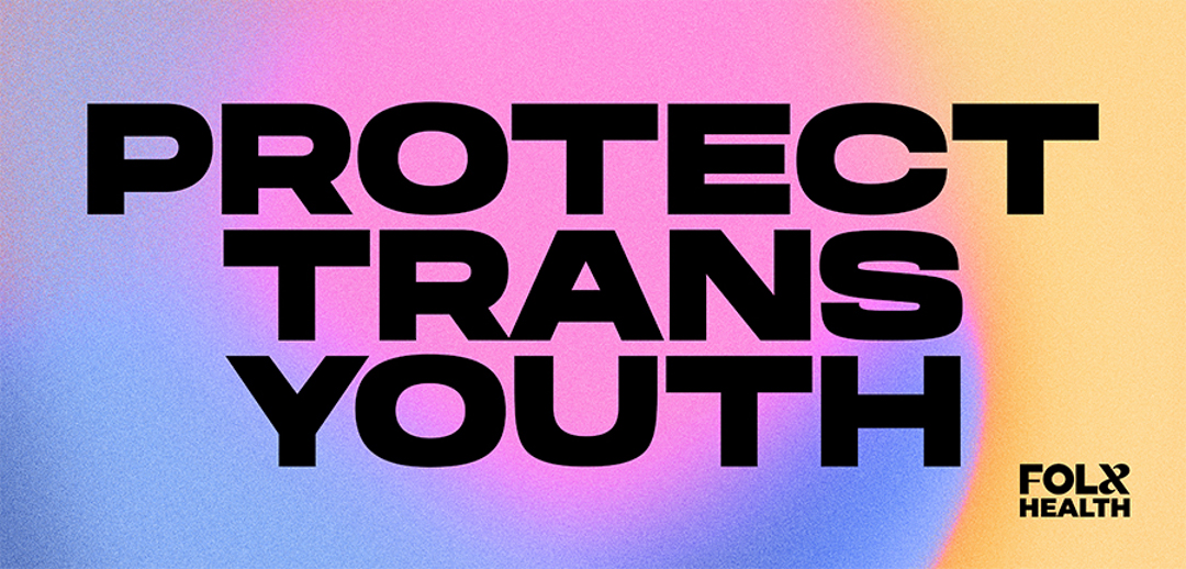
This billboard caters to its audience with a relevant design. “Protect Trans Youth” in big, bold letters delivers its message strongly and confidently, showing support and urging viewers to take action for the transgender community.
Its bold sans-serif font and colorful gradient are right on trend, pairing style with a powerful message.

The font, colors, and visuals express professionalism and trustworthiness, while the slogan “Manage Your Pain Today” delivers a succinct, direct message tied to the brand.
- Fewer elements keep it from being distracting
- Blue and black create a calm yet bold presence
- Professional photos of the doctors convey openness and trust
International Union of Operating Engineers
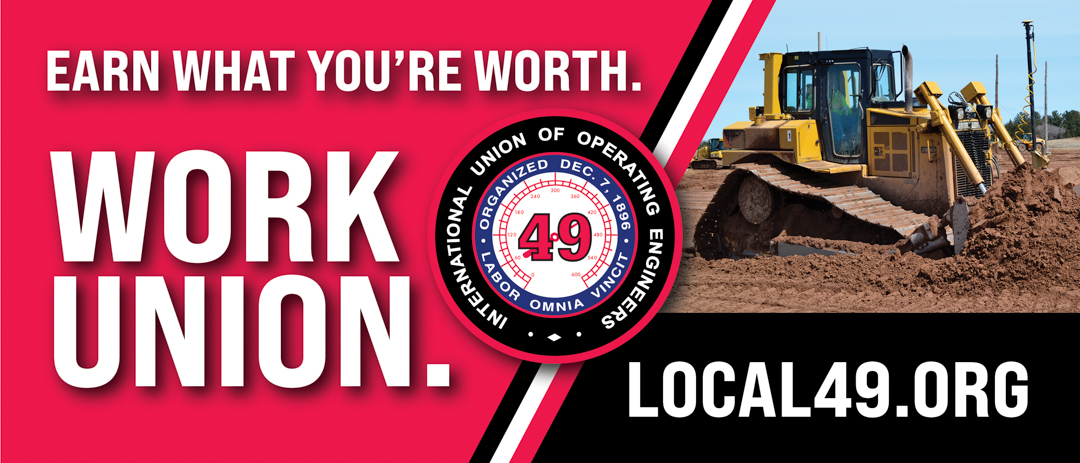
The International Union of Operating Engineers billboard turns heads with its impressive message and design. “Earn What You’re Worth” gets straight to the point about the financial benefits of union work, and “Work Union” sums it up cleverly.
- A slanted dividing line makes the two parts easy to take in
- A high-resolution tractor image looks polished and professional
- A limited red, black, and white palette creates unity and strong contrast
Create Your Own Effective Design
Create a campaign on BillboardsIn today, and we’ll help you find the perfect location and design your ad! Find us on Facebook, Instagram, or LinkedIn.