
Design Tips for Creating a Successful Ad Campaign
We get it—designing a billboard can be scary, especially if you’ve never done it before.
Your ad could go on a huge billboard beside a busy highway, a smaller one next to your storefront, or anywhere, really. But whatever the size or location, creating a stunning design that gets customers running to your business isn’t as hard as it seems. Just follow these guidelines.
Keep It Minimal
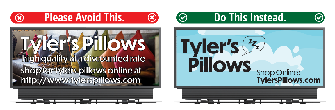
Ever sped past a billboard so packed with words and elements you didn’t know where to look? That’s what to avoid.
This helps passersby actually read your message and see your stunning photo or graphic.
Be Legible
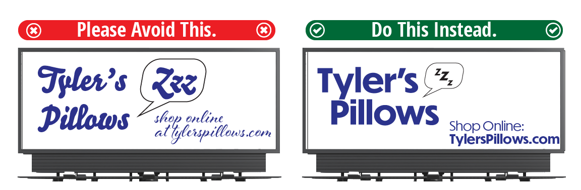
We know it’s hard to resist those fun, elegant calligraphic fonts that capture your brand to a T. But they’re really hard to read quickly.
- Use large, bold, easy-to-read typefaces
- Don’t crowd too many words into one space
- Avoid too much text overall, and skip long or difficult words
Be Bold
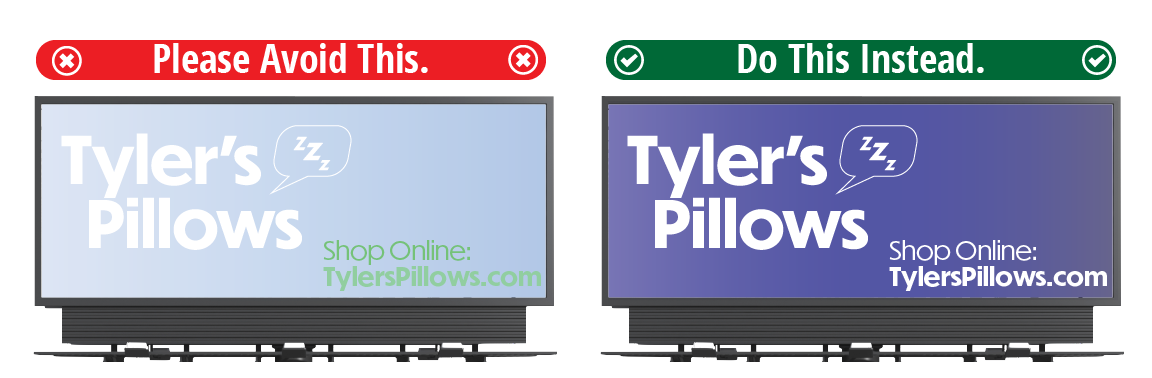
High contrast, large fonts, and engaging images get your message across quickly.
Be Remembered
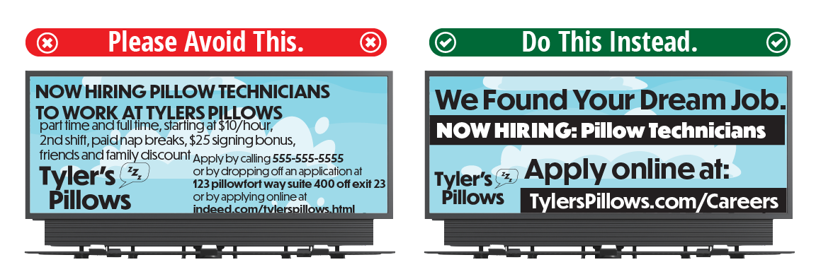
Rely on imagery over words. Use engaging elements or photos that stick in a potential customer’s mind, like catchy taglines, silly puns, and memorable photos.
Be Appropriate
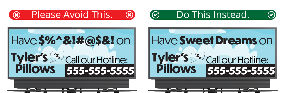
Billboards are seen by anyone who passes, and most have restrictions on what can be advertised. Categories like these have many guidelines to follow:
Need a Hand With Your Design?
Our design team is here to help, whether that’s creating your ad from scratch or giving feedback along the way. Visit our Design Page for personalized help or templates, and our Design Tips Page for more tips and tricks.