
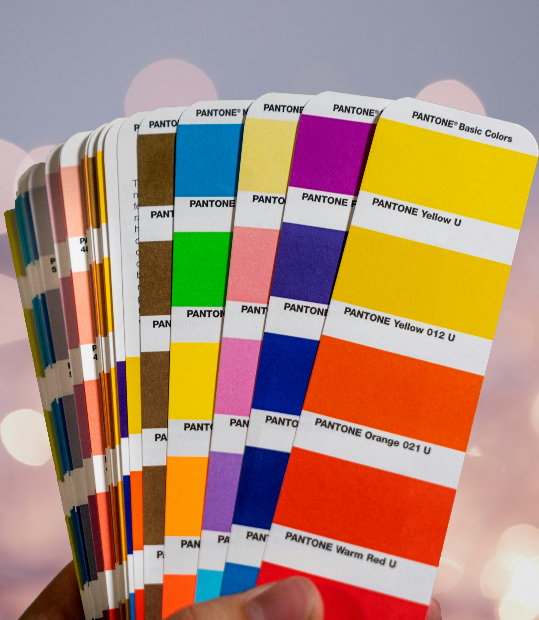
Best Colors to Use in Billboards
One of the most common questions when first buying a billboard is which color to use.
Seems like a simple enough thing that surely won’t make or break its success… right?
Visibility from far distances, emotions, and first impressions can all be affected by a billboard’s main color scheme. The shade separating pink from red can make viewers feel calm or full of passion and more inclined to act on a message. That’s the power of color, and you can harness it to maximize your success.
Contrast & Visibility
Contrast is two opposing colors, typically one light and one dark, giving a focal feature a prominent appearance.
Billboards that employ high contrast, such as dark text on a light background or vice versa, increase visibility, especially from great distances. Using contrast wisely determines whether a message is legible at all, near or far.
Color Intensity & Brightness
The more intense a billboard’s colors are, the more eye-catching they become to pedestrians and drivers. A few colors have the best results, according to research:
Bright colors grab the attention of passersby; the next step is to quickly and efficiently deliver your message.
How Do You Want to Be Seen?
Think about it: what colors do the businesses you interact with every day use? What colors do certain industries embrace or avoid?
Colors are psychologically linked and create implicit associations of trust, prosperity, and even hunger:
Blue · Healthcare
Used to invoke trust and tranquility.
Green · Finance
Red · Fast food
Used to call in attraction and stir the hunger centers.
Design With Color in Mind
Blend effective colors with powerful contrast to create ads that pop and let your message shine.